How to Make Spot Colors

QuarkXPress®

To define your own spot colors, access the Edit Color dialog box and select the color library that you want to use from the Model: pop-up menu. Make sure the Spot Color checkbox is selected. Choose the color you want from the color sample swatches, or type the reference number in the library field (PANTONE).Press the OK button to add your color to the Colors palette.


Adobe® InDesign®

To make custom spot colors, access the New Color Swatch dialog box. Select the color library that you want to use from the Color Mode: pop-up menu. Then select a color from the list of colors, or type in the reference number in the provided field (PANTONE). Press the OK button when your are finished to add your spot color to the Swatches palette.


Mircosoft® Office Publisher®

To change your Accent colors to custom spot colors, convert your colors to Spot colors or Process colors plus spot colors and select the PANTONE® tab to apply the nearest spot color equivalents.


Posted on 8:20 AM by CMYK Printing and filed under | 0 Comments »

Spot Colors

Spot colors are specific individual colors that can be used alone, or in combination with other colors, including process colors. Each spot color used will be printed with the appropriate color ink on press. There are many different spot colors and color libraries to choose from. The PANTONE® (PMS, or Pantone Matching System) color libraries are some of the more widely used color libraries in the printing industry. 

Colors selected from color libraries are specified by their reference number instead of a color name. For example, the reference of PANTONE 300 can be used instead of the color name Red. Other color libraries include FOCALTONE, TOYO, and TRUMATCH.

The important point to make here is that selections from a color library are used as separate and unique spot colors. If you use, for example, ten spot colors from the PANTONE library, you will have ten separate color inks on press. The goal, of course, is to build your document pages with only the appropriate number of colors for press.
Spot Colors as Color Builds

You can use any spot color as the basis for a CMYK color build. Simply convert your selected spot color the to the equivalent CMYK values. However, not surprisingly, there is one consideration.

Similar to how the CMYK color space cannot accurately represent all RGB colors, the CMYK color space cannot accurately represent all spot colors. You only need to look at a Pantone Color Bridge Guide® to compare any PANTONE spot color next to their equivalent CMYK build values to see the differences.
Redefined Spot Color Values

As long as you are printing your specified colors as spot colors, then it will not matter if you change the CMYK values (Edit Color). However, if you are planning on converting all your spot colors to CMYK, and you have redefined your CMYK values, then you will be altering the actual color separations, and they will no longer match any printed color guide books.

For example, if you define a color like PANTONE 300 and are planning to print this color as a spot color, you can change the color values all you want and still get the same PANTONE 300 color on press. Spot colors are specific ink colors that have predefined ink colorant values which cannot be changed.

If on the other hand, you use the same PANTONE 300, then decide to convert it to CMYK for press, and previously changed the CMYK color values, you will get a different resulting color then what is in the printed PANTONE color guide.
When To Use

Use spot colors when you have specific color needs, like matching logo colors or corporate identity pieces. When the color is just as important as the image itself, like team logos, you can use spot colors. More importantly, anytime you want a color to print consistently from page to page like in a banner or header, or from project to project, use a spot color instead of process color builds.

Some CMYK color builds are made without any 100% colors, and therefore all colors are screened. When a color is all screened and applied to text or other thin stroked graphic elements, it will produce a slightly soft or jagged edge. To produce a crisp sharp edge, use a spot color to replace the screened color builds.
Posted on 10:13 AM by CMYK Printing and filed under | 0 Comments »

Color Theory Basics

To help us understand how process color imaging are handled in offset printing let us review some basic concepts of colors and how they are reproduced.


Additive and Subtractive Colors

There are two different color gamuts, or spaces. First being the visible light spectrum, RGB (Red, Green and Blue). This color space is made up of light, and when all three RBG colors are added together they result in white. This makes up what we call the Additive Color Space.

The problem with light is that you can not print it on paper. Light is used extensively in photography, scanning, computer monitors, and television. But it is never used on press, because combining Red, Green and Blue inks on press only result in black. Therefore the opposite ink colors Cyan, Magenta and Yellow are used instead of Red, Green and Blue. When combined in various combinations they produce Red, Green and Blue, but more importantly when all are subtracted they produce white. Thus the name Subtractive Color Space.

Now if you add black to CMY to help define details and support the other color you end up with the basis of all full color image reproduction in offset lithography. These four colors go by different names, but they are all the same; process color, four-color, four-color process, and CMYK. The letter K is used to represent black, not to be confused with B which represents Blue.


Color Spectrum Chart

Now that we have shown you our two color spaces -- additive (RBG) and subtractive (CMY) -- let us take a look at them both on a color spectrum chart. This way we can visualize the differences between the two.

The first thing to notice is the relative size of the CMYK color space to the RGB color space. Neither one can reproduce the same amount of colors our eyes can see, but more importantly, the CMYK color space cannot reproduce the same colors as the RGB color space.

When we convert our RGB images to the CMYK color space for offset printing, we loose some color. Specifically, we loose the most saturated (purest) Red, Green and Blue colors at the tip of the RGB color space.


Halftone Line Screen

Once we have our images converted over to CMYK, every prepress department within a commercial offset print shop will apply a line screen to each of the four colors. Smaller dots makeup lighter color values, and larger dots produce more color. Each color screen is rotated to allow the companion colors to show thru. When combined they create a dot pattern. This process is used to create the optical effect of a full color image, with only using the process colors on press.
Posted on 9:29 PM by CMYK Printing and filed under | 1 Comments »

Define Pantone Colors


Pantone colors have been the industry standard for graphic designers and print shops for over 40 years. Using Pantone colors is essential for spot color printing, which is required when the client is printing on a liited budget or has specific color requirements.


Consistency
The Pantone Matching System was created so graphic designers could pick colors from a swatch book and receive accurate color matching on presses printing with Pantone inks. Picking from swatch books printed with the same inks helps ensure the best possible color match when the design is printed.


Why It Works
Pantone colors are created by using pre-mixed Pantone inks according to precisely defined values for each color. A large number of Pantone colors, such as metallic inks, are sold fully mixed.


Paper Variation
Because the ink absorption amount is different on coated (matte or glossy) paper, as opposed to more porous uncoated paper, Pantone uses two separate coated and uncoated swatch books. This way, designers can pick the right color for the paper they're using.


Pantone Colors and Four-Color Printing
Although Pantone colors work best with Pantone inks, Pantone created the Pantone Process Guides so designers who have to print using four-color printing can see what their Pantone colors will look like printed in the basic cyan, magenta, yellow and black inks.

Posted on 9:00 PM by CMYK Printing and filed under , | 0 Comments »

Colour Theory

Color theory encompasses a multitude of definitions, concepts and design applications. All the information would fill several encyclopedias. As an introduction, here are a few basic concepts.

The Color Wheel

A color circle, based on red, yellow and blue, is traditional in the field of art. Sir Isaac Newton developed the first circular diagram of colors in 1666. Since then scientists and artists have studied and designed numerous variations of this concept. Differences of opinion about the validity of one format over another continue to provoke debate. In reality, any color circle or color wheel which presents a logically arranged sequence of pure hues has merit.


PRIMARY COLORS
Red, yellow and blue

In traditional color theory, these are the 3 pigment colors that can not be mixed or formed by any combination of other colors. All other colors are derived from these 3 hues


SECONDARY COLORS
Green, orange and purple

These are the colors formed by mixing the primary colors.


TERTIARY COLORS
Yellow-orange, red-orange, red-purple, blue-purple, blue-green and yellow-green.

These are the colors formed by mixing a primary and a secondary color. That's why the hue is a two word name, such as blue-green, red-violet, and yellow-orange.


COLOR HARMONY
Harmony can be defined as a pleasing arrangement of parts, whether it be music, poetry, color, or even an ice cream sundae.

In visual experiences, harmony is something that is pleasing to the eye. It engages the viewer and it creates an inner sense of order, a balance in the visual experience. When something is not harmonious, it's either boring or chaotic. At one extreme is a visual experience that is so bland that the viewer is not engaged. The human brain will reject under-stimulating information. At the other extreme is a visual experience that is so overdone, so chaotic that the viewer can't stand to look at it. The human brain rejects what it can not organize, what it can not understand. The visual task requires that we present a logical structure. Color harmony delivers visual interest and a sense of order.

In summary, extreme unity leads to under-stimulation, extreme complexity leads to over-stimulation. Harmony is a dynamic equilibrium.


Some Formulas for Color Harmony

There are many theories for harmony. The following illustrations and descriptions present some basic formulas .

A color scheme based on analogous colors

Analogous colors are any three colors which are side by side on a 12 part color wheel, such as yellow-green, yellow, and yellow-orange. Usually one of the three colors predominates.  


Complementary colors are any two colors which are directly opposite each other, such as red and green and red-purple and yellow-green. In the illustration above, there are several variations of yellow-green in the leaves and several variations of red-purple in the orchid. These opposing colors create maximum contrast and maximum stability.  


Nature provides a perfect departure point for color harmony. In the illustration above, red yellow and green create a harmonious design, regardless of whether this combination fits into a technical formula for color harmony.


Color Context

How color behaves in relation to other colors and shapes is a complex area of color theory. Compare the contrast effects of different color backgrounds for the same red square.


Red appears more brilliant against a black background and somewhat duller against the white background. In contrast with orange, the red appears lifeless; in contrast with blue-green, it exhibits brilliance. Notice that the red square appears larger on black than on other background colors.

Different readings of the same color


If your computer has sufficient color stability and gamma correction (link to Color Blind Computers) you will see that the small purple rectangle on the left appears to have a red-purple tinge when compared to the small purple rectangle on the right. They are both the same color as seen in the illustration below. This demonstrates how three colors can be perceived as four colors.


Observing the effects colors have on each other is the starting point for understanding the relativity of color. The relationship of values, saturations and the warmth or coolness of respective hues can cause noticeable differences in our perception of color.

Posted on 11:00 PM by CMYK Printing and filed under | 0 Comments »

What Should You Know before you send for printing

Be Very Careful With Image Compression
File Compression, such as JPEG, can cause the loss of valuable image information. It is recommended that image compression not be applied to images. Often, images are received from online stock agencies as JPEG files so that they may be downloaded more quickly and easily from the Internet. In these cases, the file should be opened in an image editing application, such as Photoshop, and saved as uncompressed TIFF or EPS file, and kept that way.

Checking Image Resolution
For offset printing, the safest bet is 300dpi AT REPRODUCTION SIZE. While there are a number of software programs that specialize in adding print enhancing pixels, unless you have the software and have tried it out, the general rule is that what you start with, is the most you’re going to have.

The potentially confusing part is that you can get Photoshop to add pixels and seemingly increase the resolution. But, not all pixels are created equal. Unfortunately, computer created pixels don’t help the quality of the image when ink or toner lays down on paper.

The other thing to watch for is to make sure you have enough resolution when you use only part of an image. So… the best thing is to check the image resolution before you make cropping, rotation and enlargement decisions.

What about the Resolution of Line Work and Type? Type and line work print at a much higher resolution than images.

300dpi for images
1200dpi for type and line work

Setting Up Bleeds
Bleeds are necessary when you want color to go all the way to the edge of the finished sheet. To achieve this effect the image box is created larger and centered outside the page boundary. When the sheet is trimmed to the final size, the result is a professional look with the color going to the very edge. If you don’t set up your design initially with bleeds, it will cost your time and money later.

Full bleed documents are created using this method because most production presses cannot print to the very edge of the sheet on all four sides. When you create bleeds, you need to take into account the finishing process that will be used in your design. You should also avoid placing text or graphics at or near the edge of the page as variations in finishing may give you unsatisfactory results.

RGB vs. CMYK

In the world of home ink jet color printing, there is some confusion concerning CMYK color and RGB color. Many photo enthusiasts don’t realize what kind of color space their digital cameras output and are confused when it comes to printing images off of their home ink jet printers. They hit print and wonder why the printed image looks different from what they see on their monitor.

CMYK is the color description representing printed material, short for the colors Cyan, Magenta, Yellow, and Black. Mixing these 4 colors together in different amounts give you the millions of colors that reproduce the colors in printed material. These are actual inks used in printing the images you see in color magazines and books. RGB is the color description for images viewed on your computer monitors, short for Red, Green, and Blue. RGB color is actually light, and mixing different levels of these light colors creates the millions of colors that come from your computer monitor. All websites and nearly everything you see on your computer monitor is RGB unless the images have been converted to the CMYK color space.

When you print your images on your ink jet printer from your computer, your printer prints the image using CMYK inks. Viewing your image in RGB and then printing it out in CMYK may not yield the results you want. Programs such as Adobe Photoshop will convert your image from RGB to CMYK or vice versa. Some printers require the image to be CMYK before you can print the image correctly. Some printers don’t print the image correctly if the image being printed is in RGB space.

A good reason for printing with a CMYK image is to see your image in CMYK color before printing. When an image is converted to CMYK from RGB, there may be some color changes that are noticeable in the image. The reason for this is because many colors in RGB cannot be reproduced using CMYK inks. That is why it is always a good idea to convert your image to a CMYK color space before printing. You could notice significant color changes to your image, especially in the very intense color areas of your image. Some of these intense color areas may appear less intense or very dull once converted. With photo editing software, you can go in and fix these trouble color areas to your liking.

Many ink jet printers on the market today actually print directly from an RGB color image. And converting the image to CMYK may cause it to print incorrectly. You will need to determine what color space your ink jet printer supports. The packaged software usually will give you a hint regarding color spaces. If there is no option to convert the color space from RGB to CMYK, most likely, the printer will print directly from an RGB color source. Usually, the higher end ink jet printers deal with the CMYK color space as consumer level enthusiasts don’t even know these color spaces exist. New higher end ink jet printers, however, are now printing directly from the RGB color space as there is a wider spectrum of color that can be reproduced in RGB compared to CMYK color.

If all this seems confusing, not to worry. The key thing to remember is to print using RGB color if your printer and software support it. Let the software and the printer worry about getting the colors right. If you are more experienced with photo color correction and want more control over the color of the image, print in CMYK. You’ll actually be manipulating and printing the image in the color space your ink jet printer’s inks are using. You will be able to see the limits of the CMYK printing color spectrum right on your monitor. Getting color right with RGB and CMYK is totally different from calibrating your printer to match the colors on your monitor. That is actually the second step in getting the best color out of your prints. Understanding the difference between RGB and CMYK is the first step in getting the best print outs on your home ink jet printer.

Posted on 8:05 PM by CMYK Printing and filed under | 0 Comments »

Understanding Color

Primary Colors | Additive Color (RGB) | Subtractive Color (CMY)


What is Color?
Color is all around us. It is a sensation that adds excitement and emotion to our lives. Everything from the cloths we wear, to the pictures we paint revolves around color. Without color; the world (especially RGB World) would be a much less beautiful place. Color can also be used to describe emotions; we can be red hot, feeling blue, or be green with envy.

In order to understand color we need a brief overview of light. Without light, there would be no color, and hence no RGB World. Thank God for light!

Light is made up of energy waves which are grouped together in what is called a spectrum. Light that appears white to us, such as light from the sun, is actually composed of many colors. The wavelengths of light are not colored, but produce the sensation of color.

Visible light - The wavelengths our eyes can detect is only a small portion of the electromagnetic energy spectrum. We call this the visible light spectrum. At one end of the visible spectrum are the short wavelengths of light we perceive as blue. At the other end of the visible spectrum are the longer wavelengths of light we perceive as red. All the other colors we can see in nature are found somewhere along the spectrum between blue and red. Beyond the limits at each end of the visible spectrum are the short wavelengths of ultraviolet light and Xrays and the long wavelengths of infrared radiation and radio waves, which are not visible to the human eye.
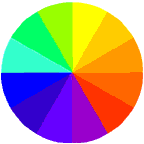

Primary Colors  

If the visible portion of the light spectrum is divided into thirds, the predominant colors are red, green and blue. These three colors are considered the primary colors of the visible light spectrum.

Primary colors can be arranged in a circle, commonly refered to as a color wheel. Red, green and blue (RGB) form a triangle on the color wheel. In between the primary colors are the secondary colors, cyan, magenta and yellow (CMY), which form another triangle.

The media and methods used to reproduce color include color paintings, printing presses, color film, color monitors, color printers, etc. There are only two basic ways, however, of reproducing color... additive and subtractive.


Additive Color System (RGB)

The additive color system involves light emitted directly from a source, before an object reflects the light. The additive reproduction process mixes various amounts of red, green and blue light to produce other colors. Combining one of these additive primary colors with another produces the additive secondary colors cyan, magenta, yellow. Combining all three primary colors produces white.

Television and computer monitors create color using the primary colors of light. Each pixel on a monitor screen starts out as black. When the red, green and blue phosphors of a pixel are illuminated simultaneously, that pixel becomes white. This phenomenon is called additive color. To illustrate additive color, imagine three spotlights, one red, one green and one blue focused from the back of an ice arena on skaters in an ice show. Where the blue and green spotlights overlap, the color cyan is produced; where the blue and red spotlights overlap, the color magenta is produced; where the red and green spotlights overlap the color yellow is produced. When added together, red, green and blue lights produce what we perceive as white light.

As mentioned before, television screens and computer monitors are examples of systems that use additive color. Thousands of red, green and blue phosphor dots make up the images on video monitors. The phosphor dots emit light when activated electronically, and it is the combination of different intensities of red, green and blue phosphor dots that produces all the colors on a video monitor. Because the dots are so small and close together, we do not see them individually, but see the colors formed by the mixture of light. Colors often vary from one monitor to another. This is not new information to anyone who has visited an electronics store with various brands of televisions on display. Also, colors on monitors change over time. Currently, there are no color standards for the phosphors used in manufacturing monitors for the graphics arts industry.

All image capture devices utilize the additive color system to gather the information needed to reproduce a color image. These devices include digital cameras, flatbed scanners, drum scanners, and video cameras.

To summarize: Additive color involves the use of colored lights. It starts with darkness and mixes red, green and blue light together to produce other colors. When combined, the additive primary colors produce the appearance of white.


Subractive Color System (CMY)

Photographs, magazines and other objects of nature such as an apple; create color by subtracting or absorbing certain wavelengths of color while reflecting other wavelengths back to the viewer. This phenomenon is called subtractive color. 

A red apple is a good example of subtractive color; the apple really has no color; it has no light energy of its own, it merely reflects the wavelengths of white light that cause us to see red and absorbs most of the other wavelengths which evokes the sensation of red. The viewer (or detector) can be the human eye, film in a camera or a light-sensing instrument.

The subtractive color system involves colorants and reflected light. Subtractive color starts with an object (often a substrate such as paper or canvas) that reflects light and uses colorants (such as pigments or dyes) to subtract portions of the white light illuminating an object to produce other colors. If an object reflects all the white light back to the viewer, it appears white. If an object absorbs (subtracts) all the light illuminating it, no light is reflected back to the viewer and it appears black. It is the subtractive process that allows everyday objects around us to show color.

Color paintings, color photography and all color printing processes use the subtractive process to reproduce color. In these cases, the reflective substrate is canvas (paintings) or paper (photographs, prints), which is usually white.

Printing presses use color inks that act as filters and subtract portions of the white light striking the image on paper to produce other colors. Printing inks are transparent, which allows light to pass through to and reflect off of the paper base. It is the paper that reflects any unabsorbed light back to the viewer. The offset printing process uses cyan, magenta and yellow (CMY) process color inks and a fourth ink, black. The black printing ink is designated K to avoid confusion with B for blue. Overprinting one transparent printing ink with another produces the subtractive secondary colors, red, green, blue.

The illustrations below show process inks printed on white paper. Each process printing ink (cyan, magenta, yellow) absorbs or subtracts certain portions of white light and reflects other portions back to the viewer. Process printing inks are transparent. It is the paper that reflects unabsorbed light back to the viewer.

To be reproducible on press, an original color image, such as a photograph, must first be converted into a pattern of small dots for each of the four colors (CMYK). When printed with ink on paper, the small dots fool the eye and give the visual appearance of the original Image. 

To summarize: Subtractive color involves colorants and reflected light. It uses cyan, magenta and yellow pigments or dyes to subtract portions of white light illuminating an object to produce other colors. When combined in equal amounts, pure subtractive primary colors produce the appearance of black.


Posted on 1:00 AM by CMYK Printing and filed under , , | 0 Comments »